

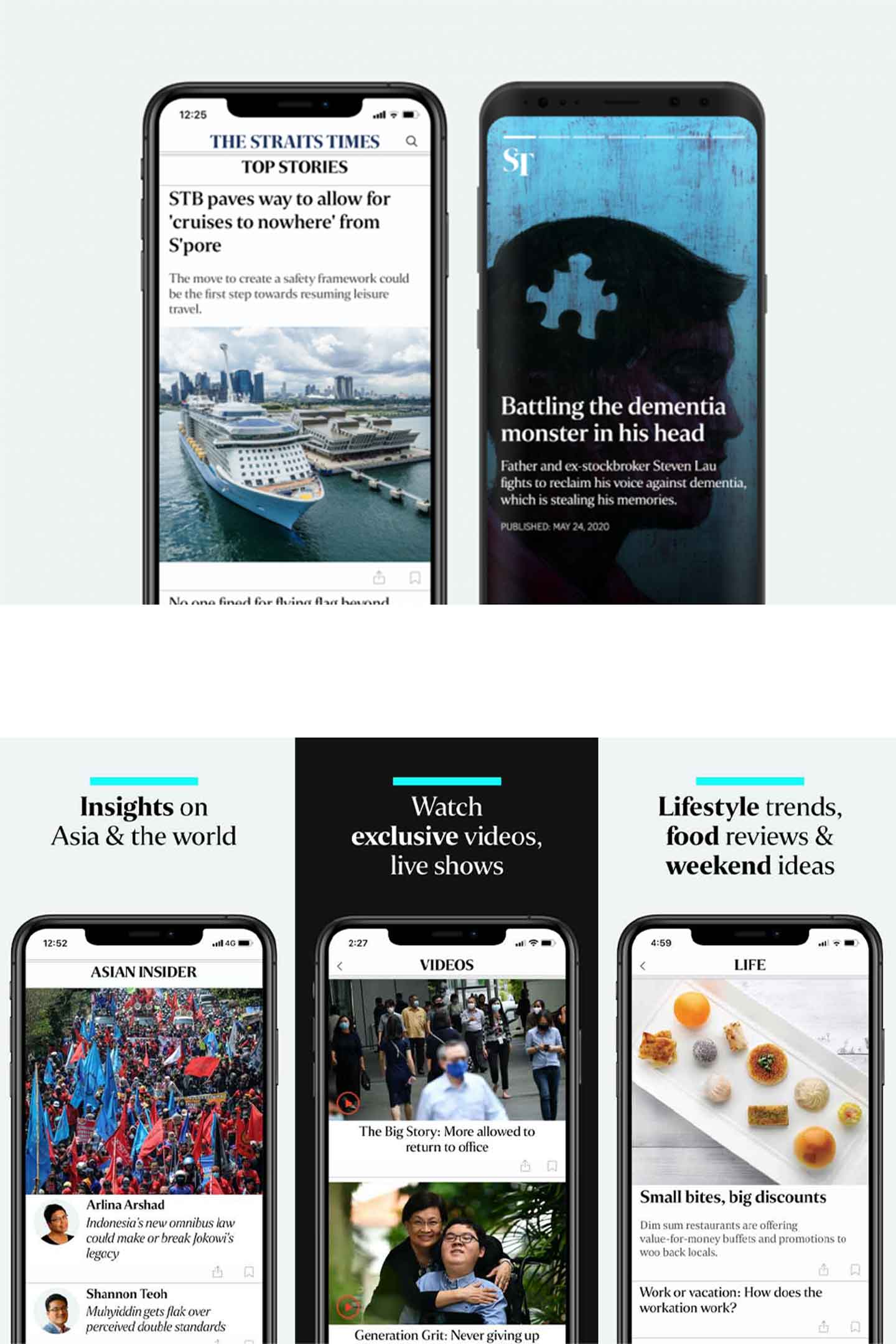
Straits Times
Redesigning The App Experience
Project type:
Personal project
Role:
User research, UX Design, Prototyping
Duration:
2 weeks
What is The Straits Times?
The Straits Times is an English-language daily broadsheet newspaper that's based here in Singapore. It is the most-read newspaper in Singapore, reaching around 1.33 million people daily.
In line with the digital age, The Straits Times also provides news on its own mobile app, making it easier for readers and allows them to get news wherever and whenever.
So why this redesign?
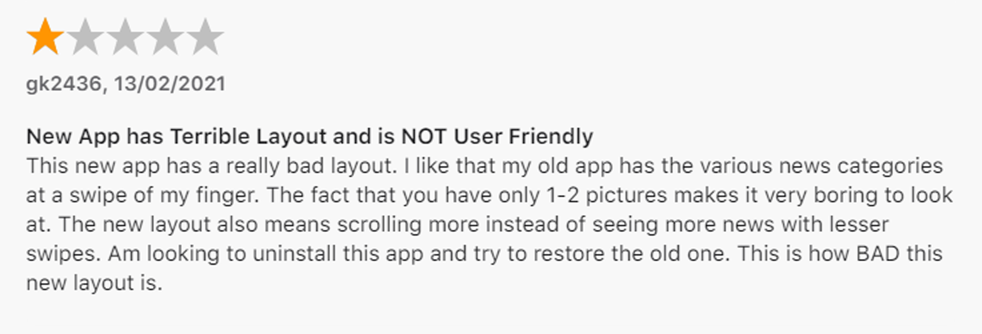
Like many other avid readers of the Straits Times, I was greeted with a new look of its revamped mobile app late in October 2020. For an updated app, the design felt oddly outdated with it poor organisation, messy layout, and inconsistent visuals. This makes it a perfect UX redesign case study to work on.
There are many usability issues in the current design
An in-depth analysis of the current Straits Times app revealed usability flaws in its overall experience, functionalities, and overall information architecture which are summarised as follows:
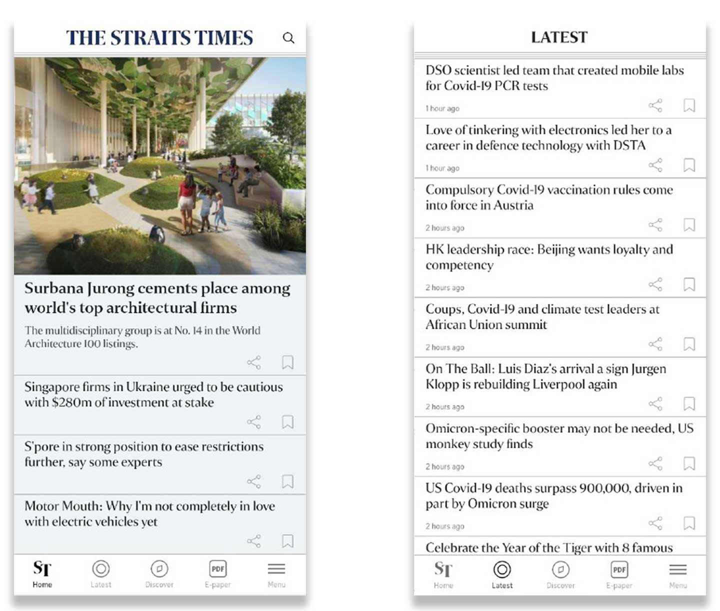
Poor information hierachy and navigation
Articles are not tagged with their respective topics which require a lot of guesswork from the users when skimming through the headlines.
Furthermore, articles that are listed on the latest news are not organised based on common topics, but rather sorted by their publish time and date.
Inconsistency in UI elements
The app appears to have too many different styles which sends mixed signals to the users. The sizes, shape, color and layout of some UI elements are not consistent throughout the app which can cause confusion to users.
Some icons are overly and certain pages have weak visual signifiers. Touch targets are also too, which are frustrating to tap.
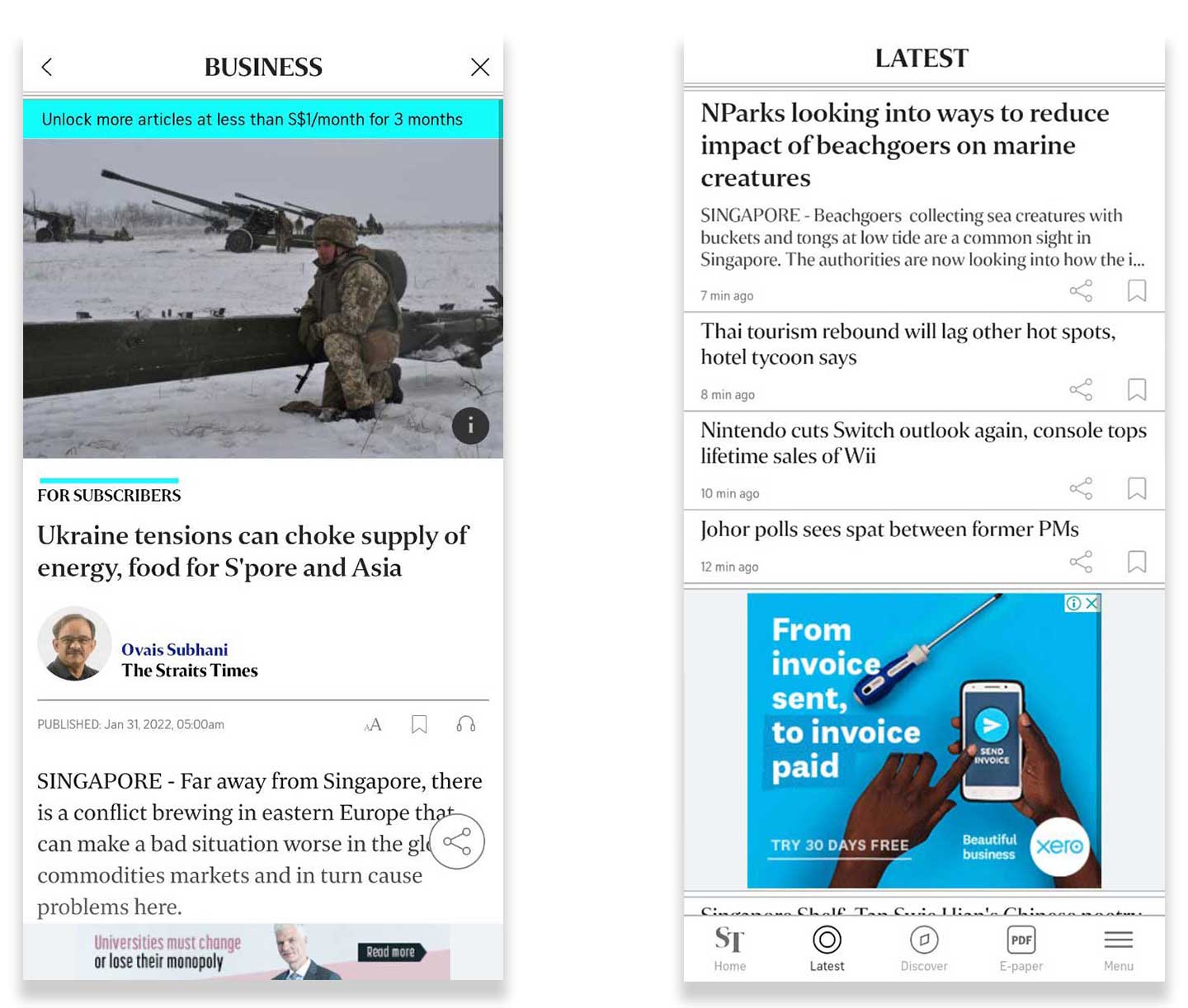
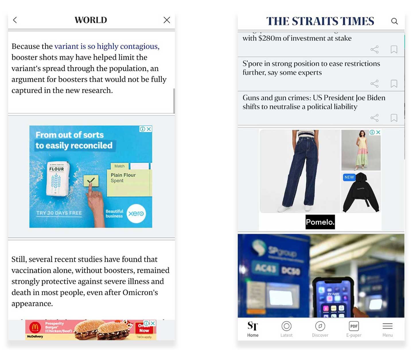
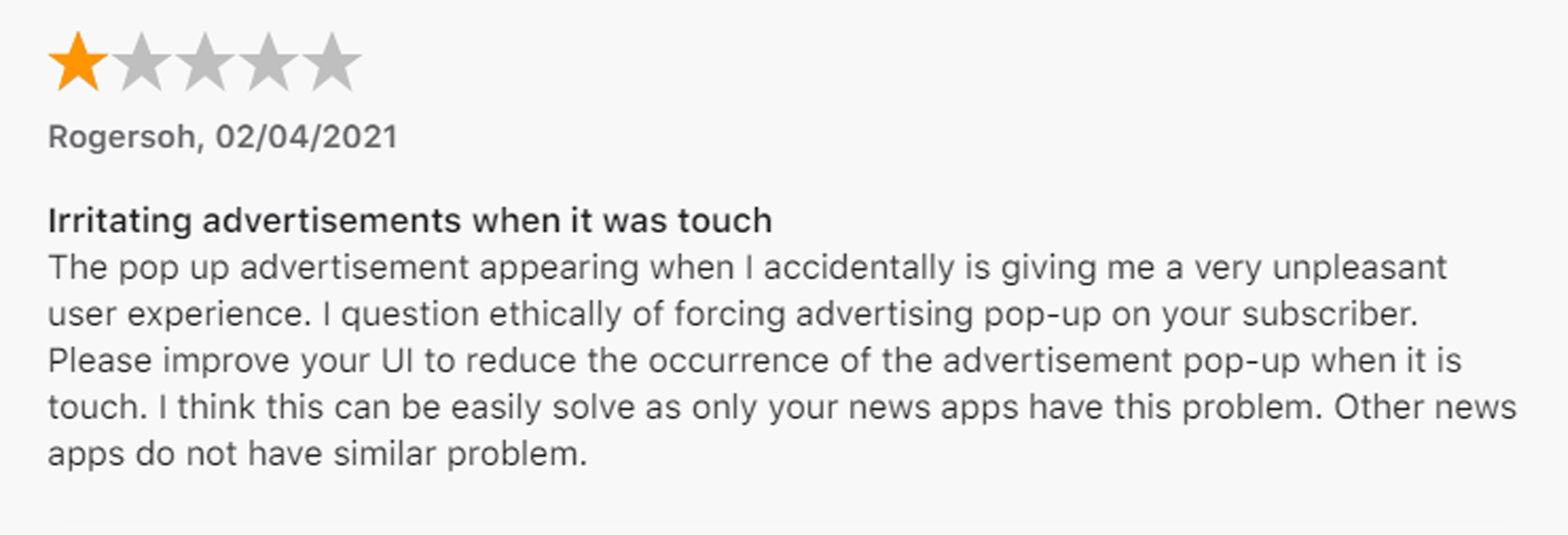
Intrusive advertisements
The advertisements are excessive and poorly positioned within the content which interrupts the reading experience. Based on my experience, an article can have as many as 4 advertisements that are embedded within the content.
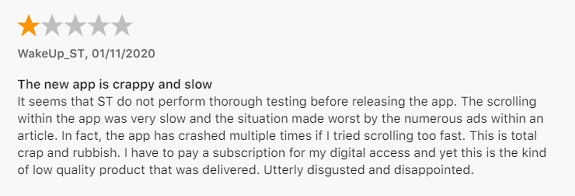
And it's clear that other users also feel the same way about the app as well
A quick scan of the app reviews (both Google Play Store and App Store) validated the problems I'd previously pointed out and also highlighted to me what kind of challenges other users are facing, which generally fell into the following themes:
Confusing layout and navigation
Inconsistent visual elements with poor UX
Frequent bugs and glitches
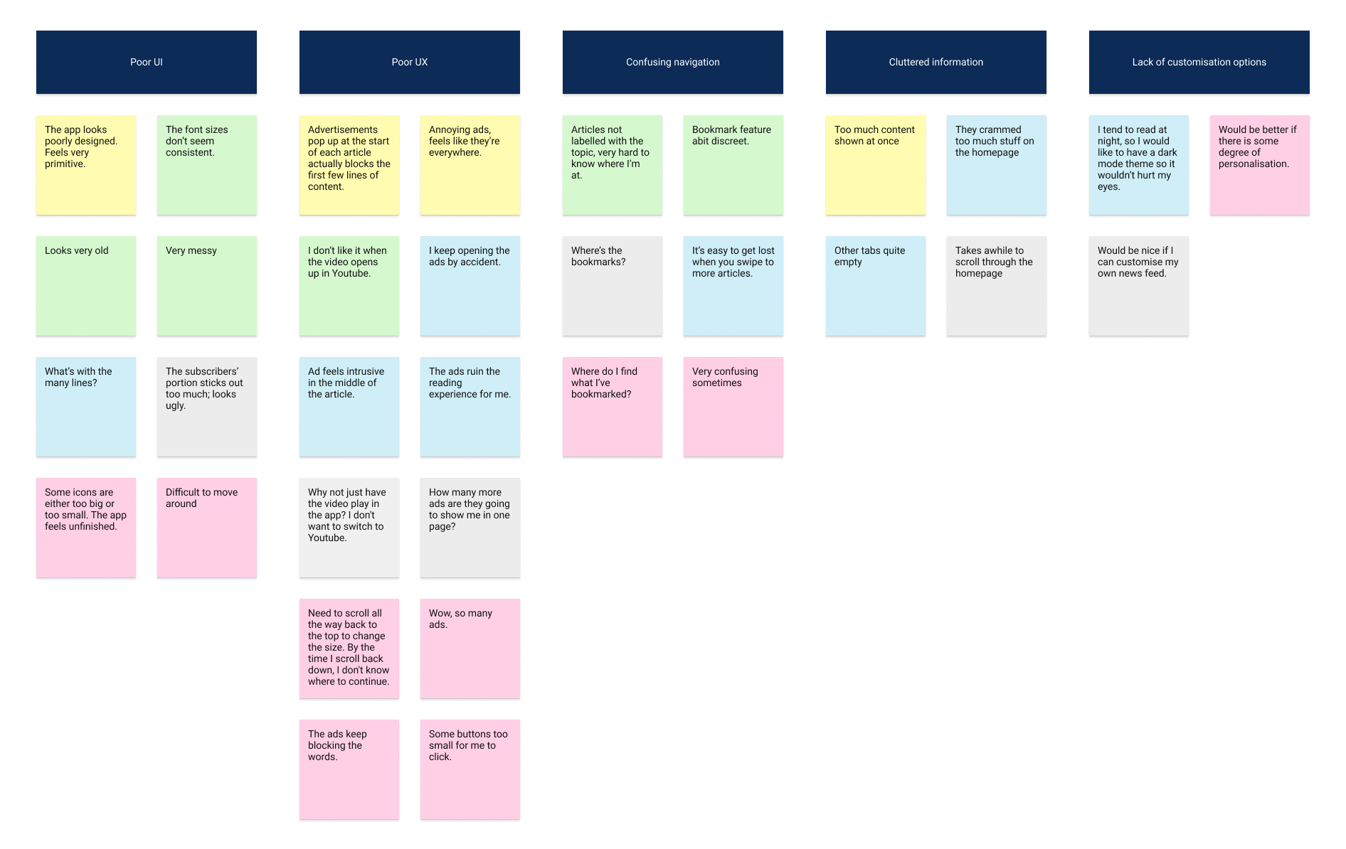
All of our interviewees would encounter problems when using the current app
I conducted usability testing of the current app with 5 users who fit the profile of the Straits Times’s target demographic of tech-savvy intellectuals. The participants are observed to be struggling with the following themes:
-
Pain point #1
Inconsistent and cluttered UI elements that are hard to read"The app looks poorly designed. Feels very primitive."
-
Pain point #2
Poor UX and ads placement"The ads ruin the reading experience for me."
-
Pain point #3
Confusing navigation as articles are not tagged with topic"Very confusing sometimes. I don't know what topic or section I'm at once I go beyond the main tabs."
-
Pain point #4
Lack of personalisation options"I tend to read at night, so I would like to have a dark mode theme so it wouldn’t hurt my eyes."
Across the usability testing sessions, I also noted some common habits and behaviours that the users displayed which are as follows:
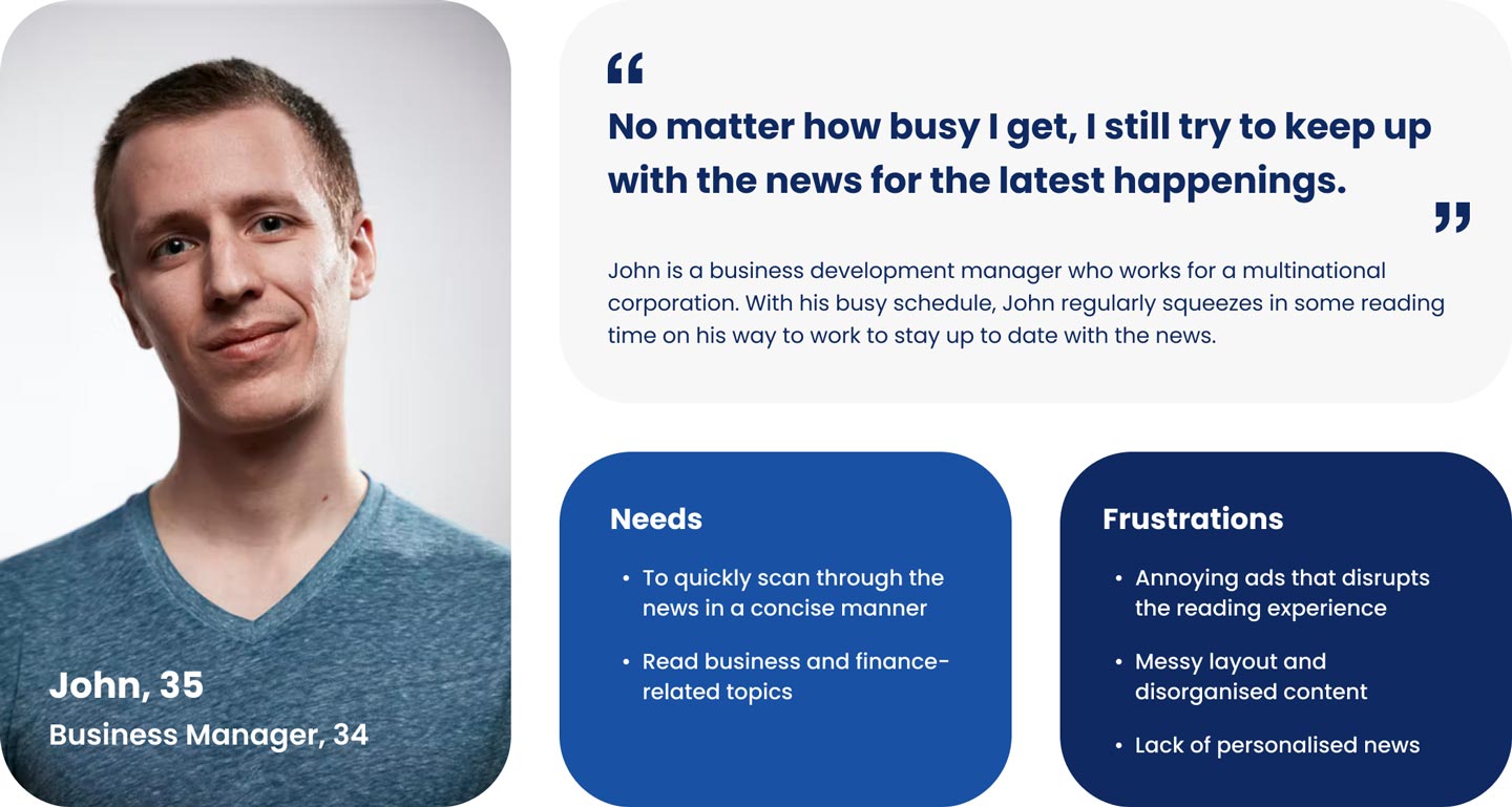
Who is the target audience, and what is their problem?
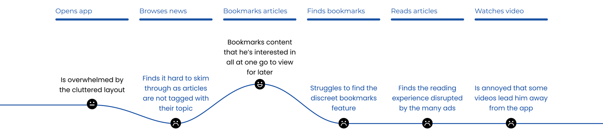
Based on the interview insights, I then crafted a user persona and journey map to better understand the users in terms of their end-to-end experience and have a clearer design direction to guide my ideation process.
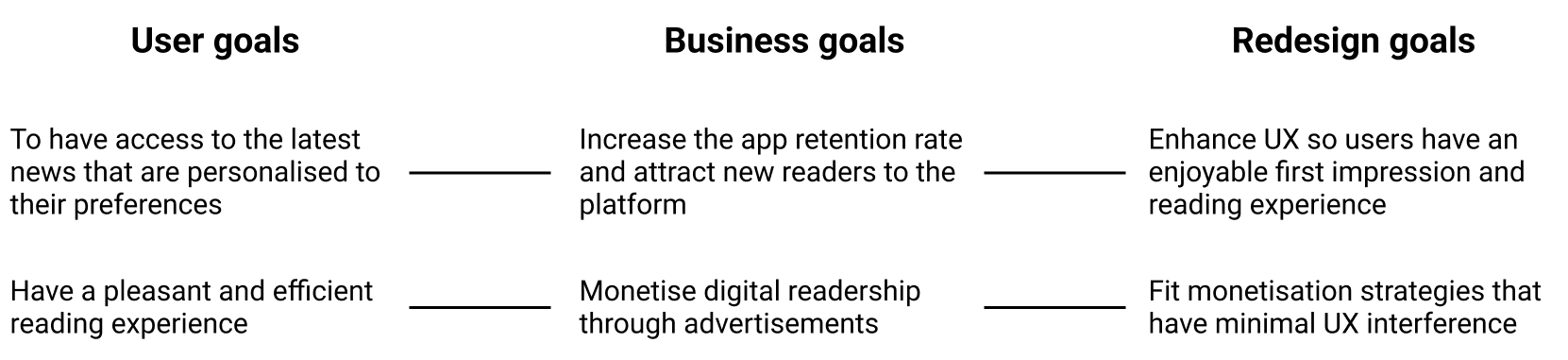
How might we redesign the app that makes the reading experience more seamless and personalised for users?
There is a clear business incentive to redesign the current app based on increasing digital readership
Improving the app’s user experience has numerous potential benefits, including increased revenue, improved user retention and loyalty, and lowered costs of customer acquisition.
*Please keep in mind that this case study was done before the Singapore Press Holdings announced the restructuring of its media business into a not-for-profit entity.
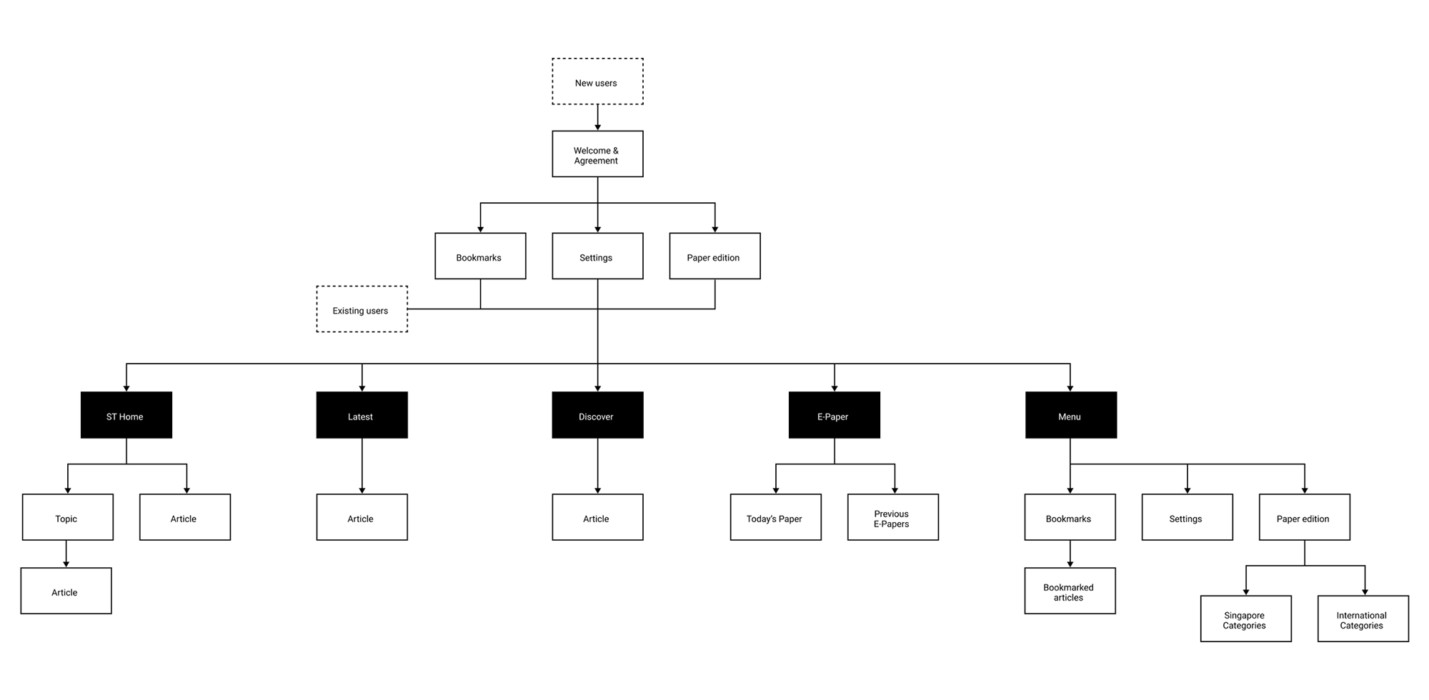
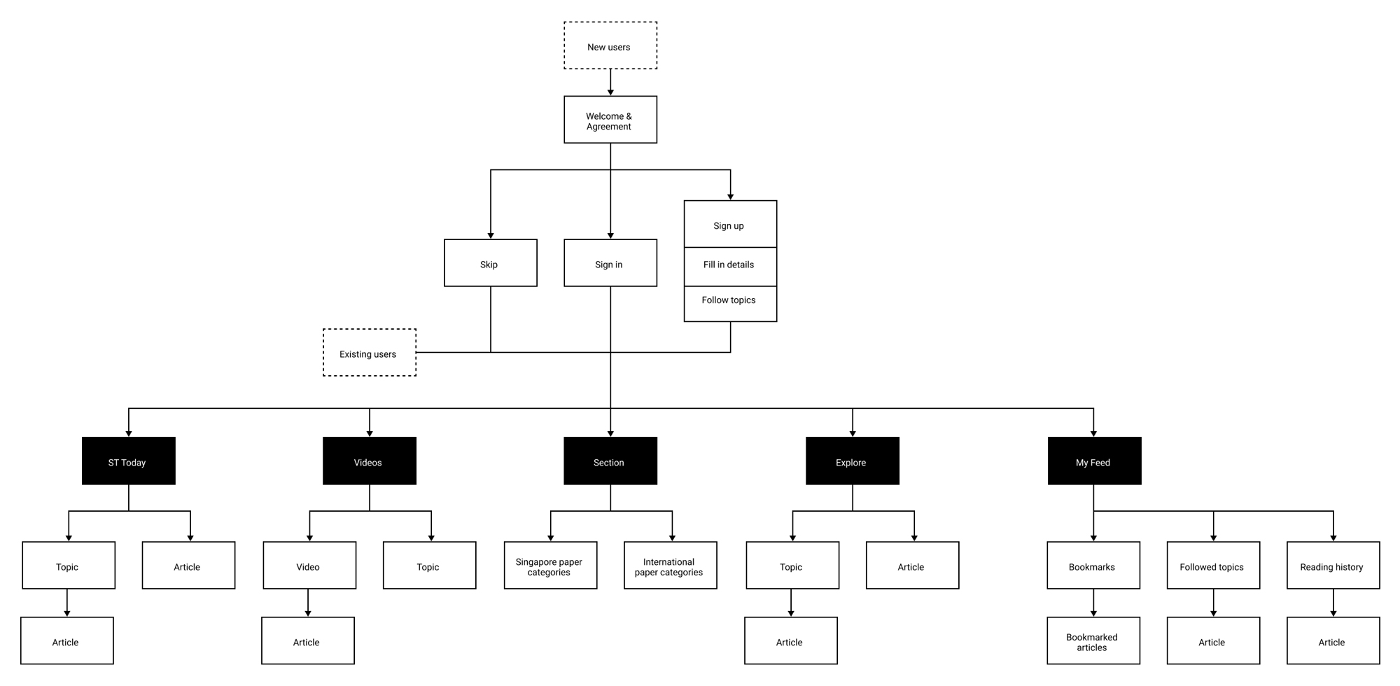
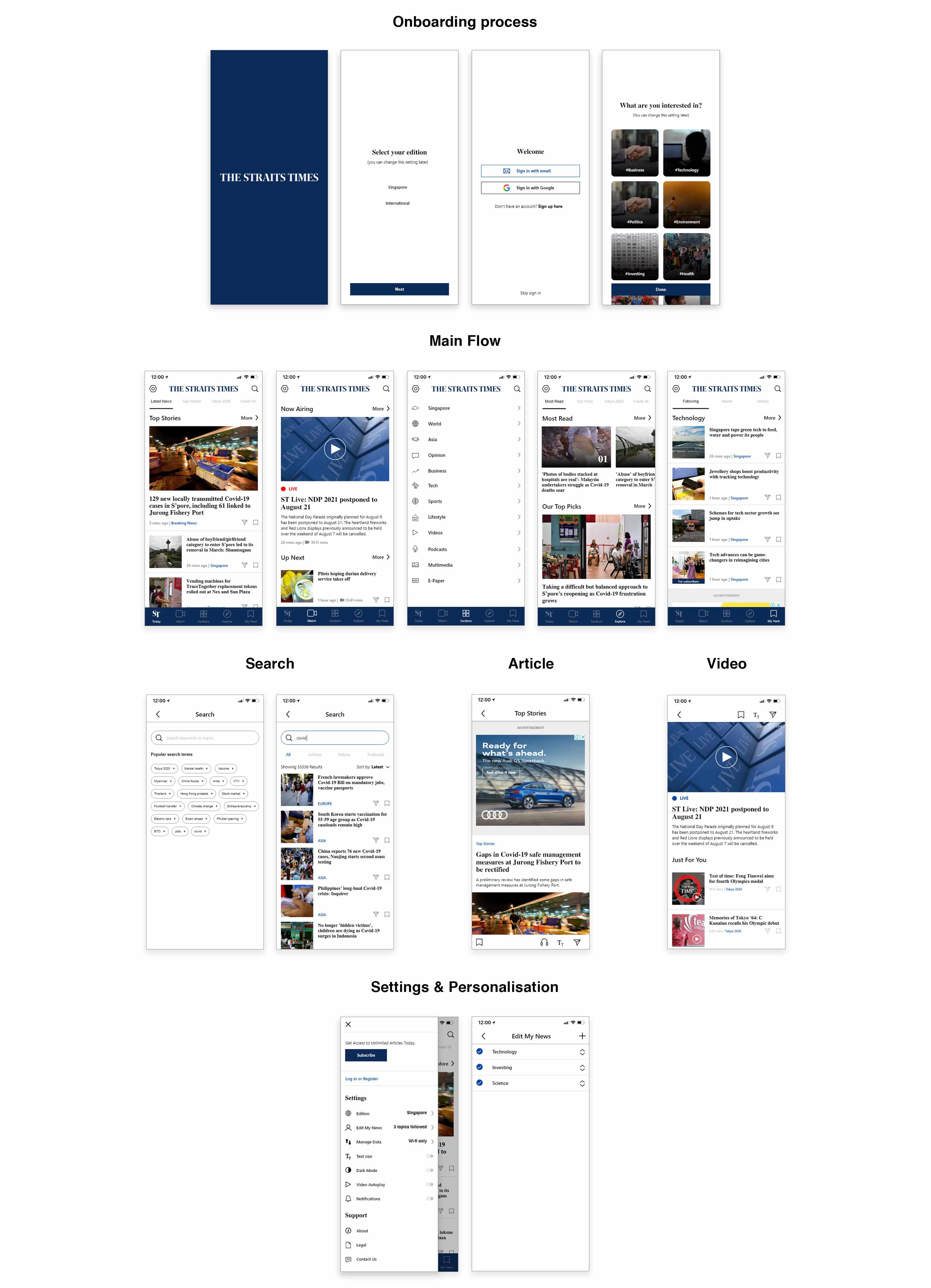
Distributing content across all tabs and streamlining the user flow
Before this, the unequal distribution of content across tabs makes certain tabs excessively lengthy. I reorganised and sorted through the information architecture in order to streamline the overall user flow and allow users to quickly access the news based on the category.
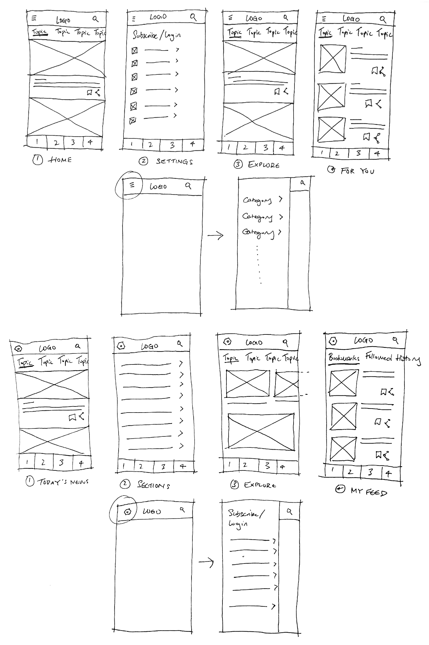
Sketches & Wireframes
With the design goals and app map set in stone, I started brainstorming and developing ideas that can help me achieve these goals. I went through the UI of the current Straits Times app, its competitors, and other news and magazine apps for ideas and inspirations.
I then sketched out all the possible layout until it came down to the one that best addressed the users' pain points. I then based my subsequent prototype solutions based on this iteration before moving on to the wireframes.
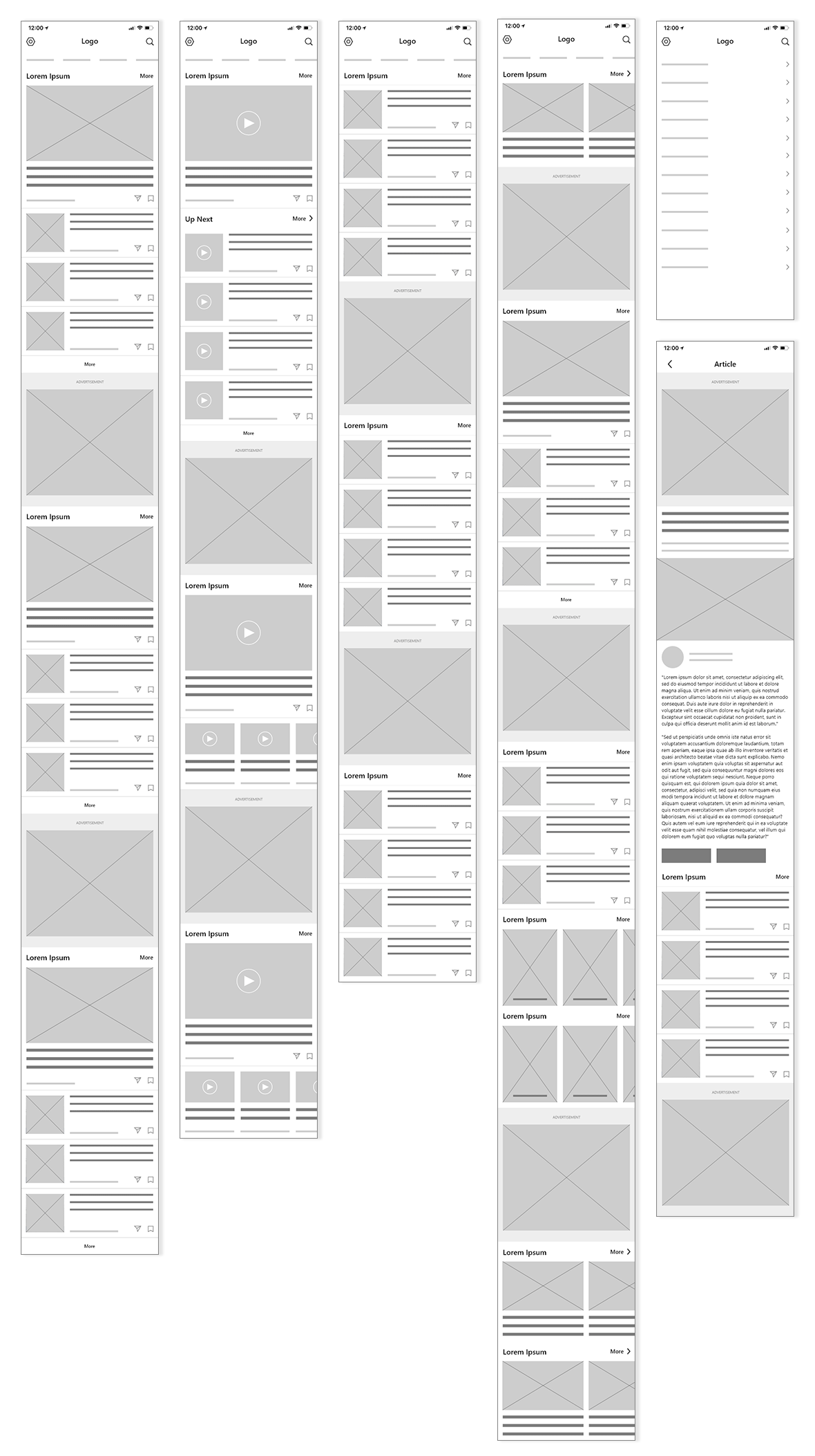
High-Fidelity Prototype
Addressing the confusing navigation
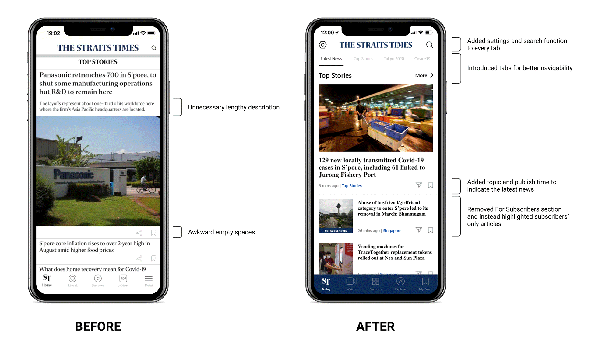
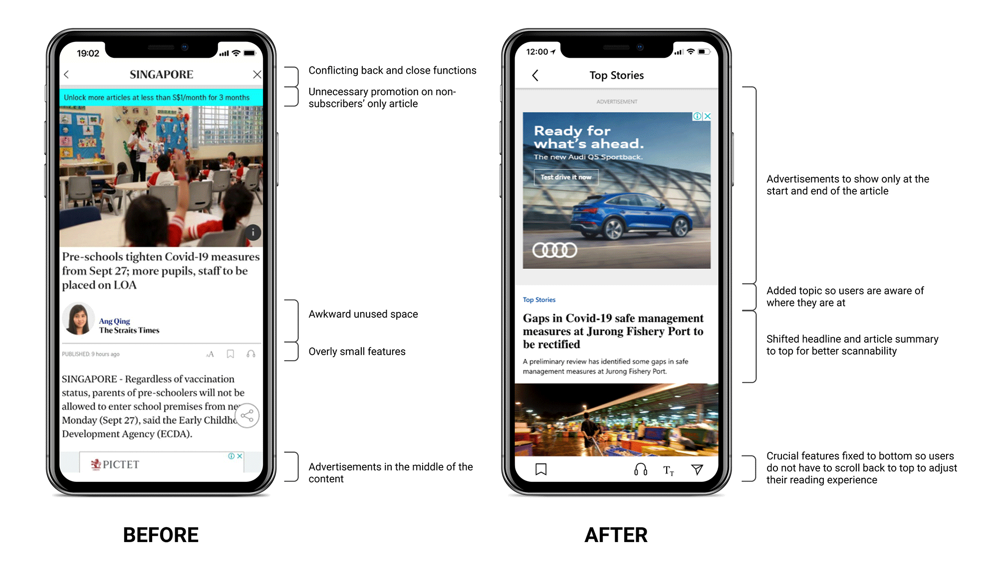
I changed ST Home to ST Today so the tab will only display the articles that are published on the current day so time-strapped users can quickly skim through the latest news.
The unneccessary For Subscribers' section was removed and instead, any subscribers' only articles are tagged. All articles are also labelled with their topic, publish date and time to assist users with navigation.
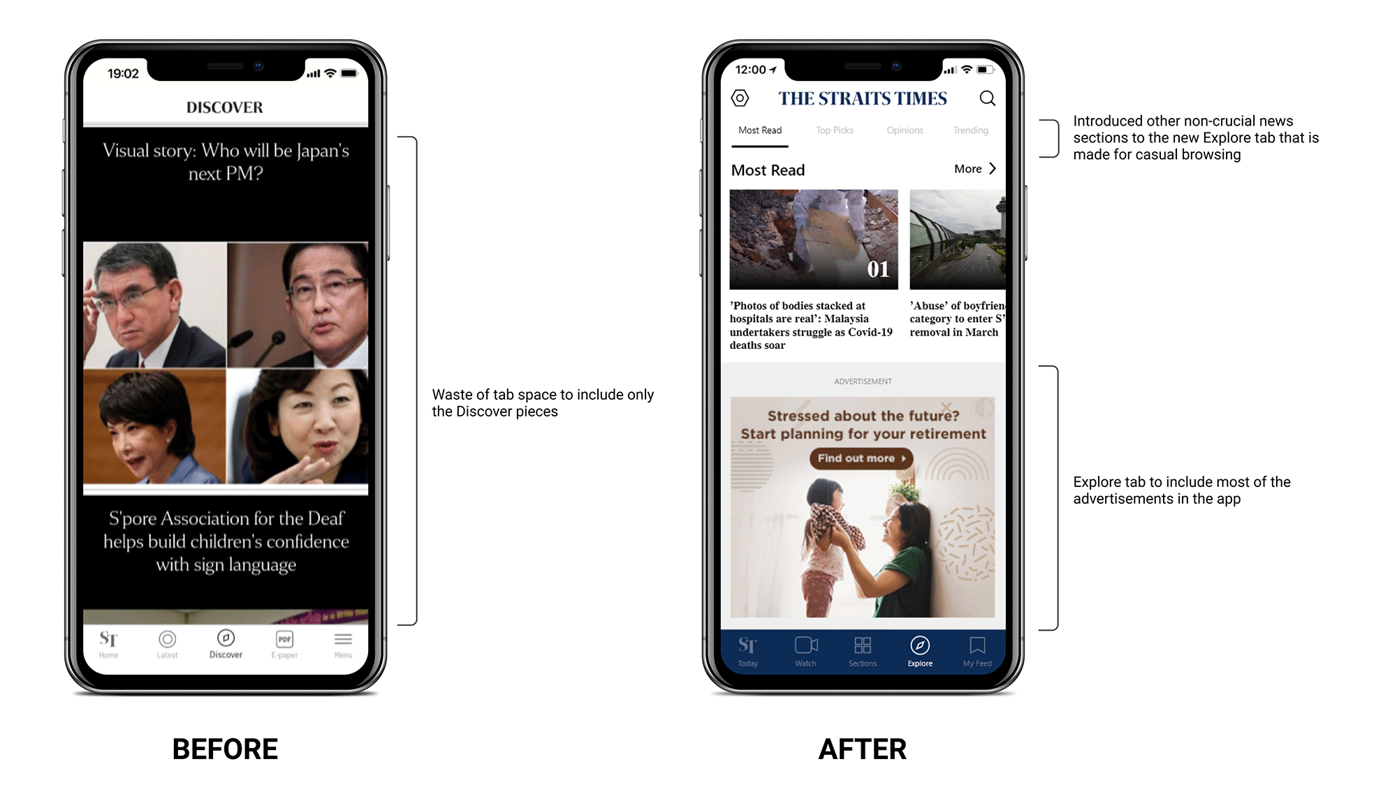
Addressing the unequal content distribution and poorly placed advertisements
Currently, the discover tab only contains visual stories. I changed it into the Explore tab which will hold most of the advertisements and is dedicated to casual news such as podcasts, lifestyle and entertainment topics.
This way, the ST Home tab will only contain the latest and important news with as little advertisements as possible for a positive first impression of the app.
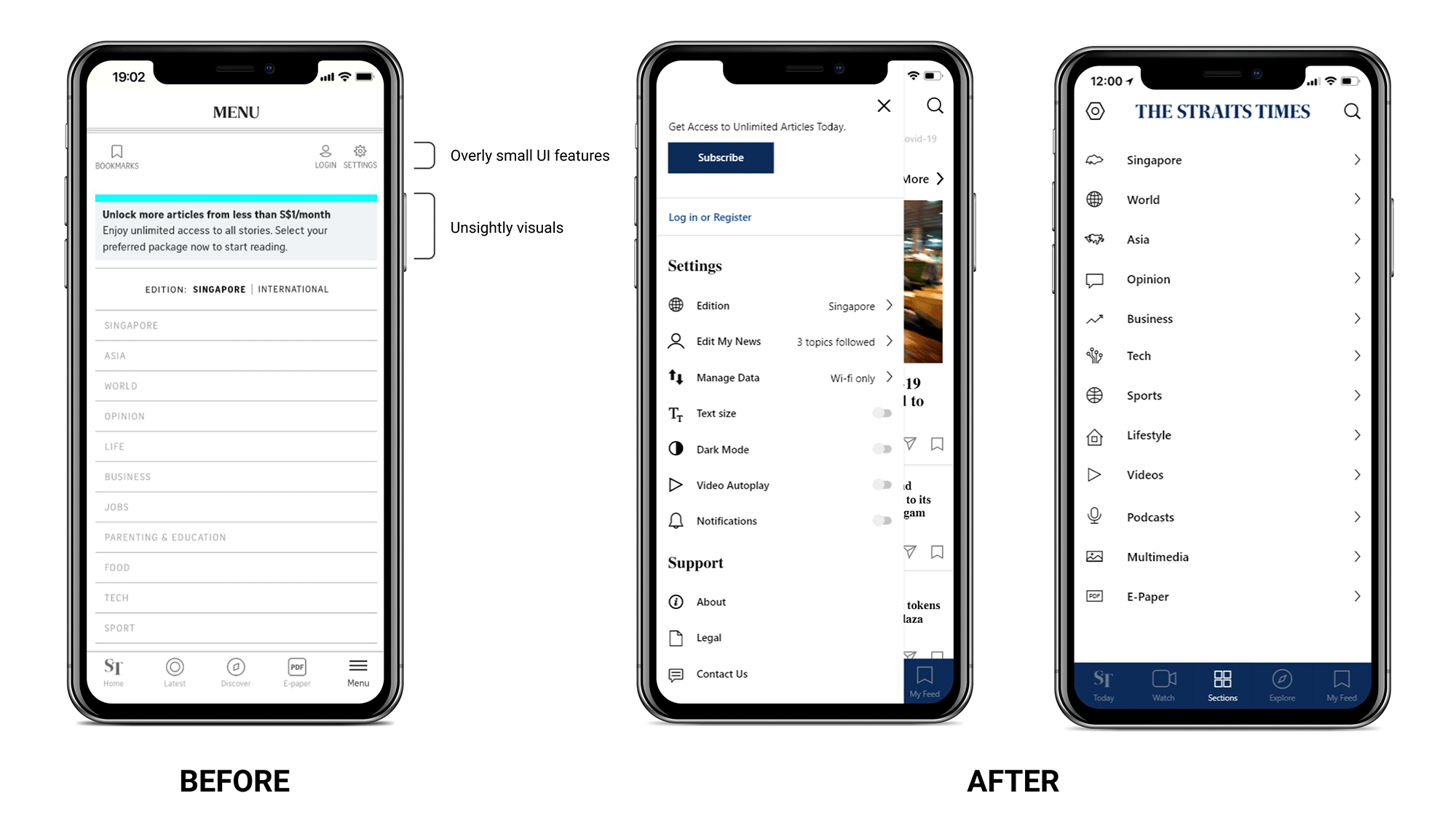
Addressing the inconspicious settings and streamlining the user flow
I separated the current menu into 2 parts: (1) the new Sections tab and (2) settings feature so users can immediately access the settings from any main tab.
This makes the navigation feel more intuitive and it also makes the settings feature more prominent than it was before.
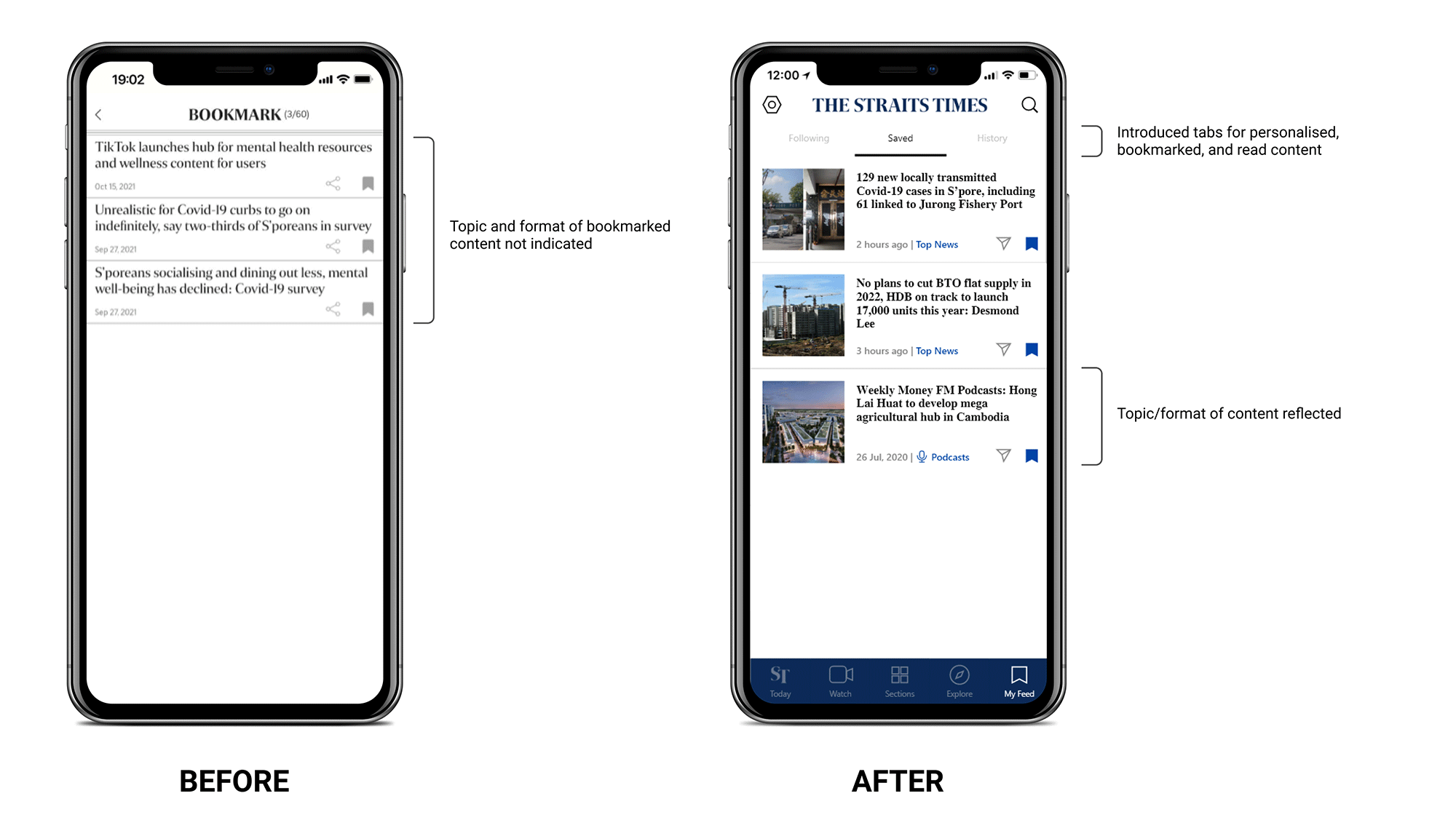
Addressing the inaccessible bookmarks feature and providing personalised content for users
Instead of having users go into the settings tab and search for the bookmarks feature, I introduced a tab that is dedicated to providing personalised content to users based on their indicated interests, bookmarked articles, and reading history.
This way, there is a clear organisation of news based on the important news of the day, casual news, and personalised news.
Addressing the poor UX and reading experience
For the article page, I added a reading time that lets time-strapped users know of the article's read time. As for the bookmarks and reading aid features, I adjusted them into a fixed bar at the bottom so users do not have to scroll back up to the top of the article to use these features like they do now.
I also made sure to remove the subscription promotional bar from the non-subscribers' only articles. Most importantly, any ads are now situation only at the top and bottom of the content, minimising the disruption to the user's reading experience.
All of our participants are satisfied with the new design
To compare between the two designs, I ran a usability study with 6 participants. During each interview, participants are asked to compare the designs in terms of the reading experience, layout, information hierarchy and visual design.
At the end of each interview, participants are given a questionaire to rate their overall experience with both the original and redesigned app. The results are summarised below:
Overall usability score (out of 7)
Before
3.8
After
6.3
Reflections
Takeaways
As this is my first ever redesign of an existing product, it was a struggle not to introduce new functionalities that can disrupt the existing functionalities that users already enjoy or have no problems with. After all, a redesign doesn't call for a complete replacement of the existing product. It should be recognizably the same, and better.
Next Steps
If I had more time, I would:
- Consider which features are valuable or should be prioritised based on data and research.
- Conduct more extensive research, as it‘s a complex and extensive product with many stakeholders.